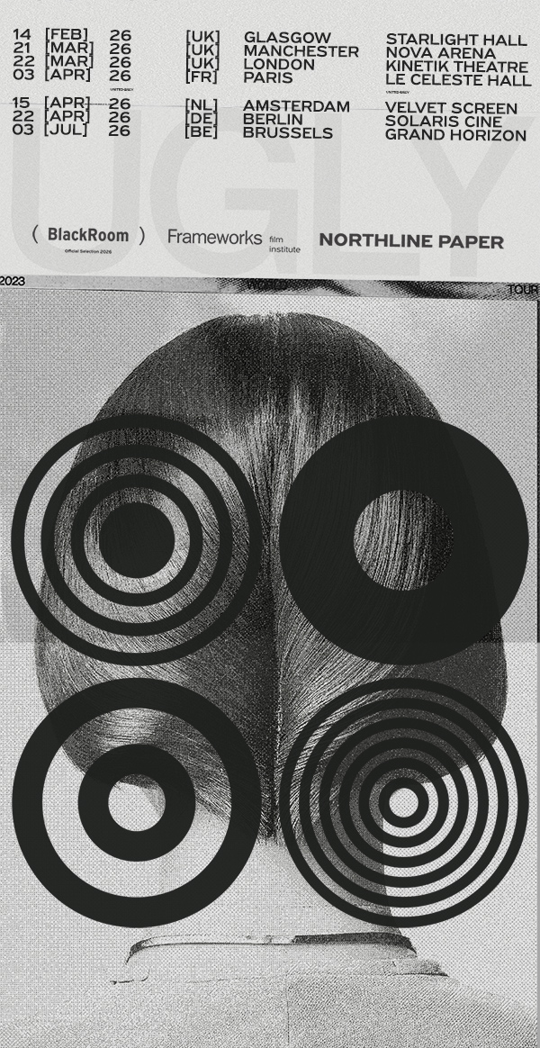
The design approach for the visual identity of Many Eyes is structurally anchored in the principles of Swiss Modernism and the International Typographic Style, drawing its primary inspiration from the work and compositional rigor of Hermann Eidenbenz. Informed by the brand’s title, the design process translates the concept of multi-perspective observation and cinematic viewing angles into a strict, geometrically articulated system of visual communication.
The logo’s architecture relies on decomposing the verbal unit into four isometric typographic blocks to establish a syncopated visual cadence. This structural configuration transforms the lettering into a solid architectural module, where the equilibrium between character mass of the bold sans-serif typefaces and negative space dictates a dual reading vector, horizontal and vertical, disrupting linear reading habits and provoking the viewer’s subconscious engagement.
Concurrently, the four quadrants constituting the logo’s grid operate as autonomous focal zones, serving as a direct visual metaphor for multi-lens cinematic observation and multi-focal viewing. The integration of concentric circles and solid discs functions as an abstract rendition of the optical lens and iris, generating perceptual depth, optical illusions, and high-contrast monochrome tension. This identity system scales with absolute modular flexibility across all touchpoints, from corporate stationery and editorial publications to technical apparel and urban environments, striking a nuanced balance between the institutional authority of classical modernism and the experimental ethos of a contemporary, artist-driven production lab.