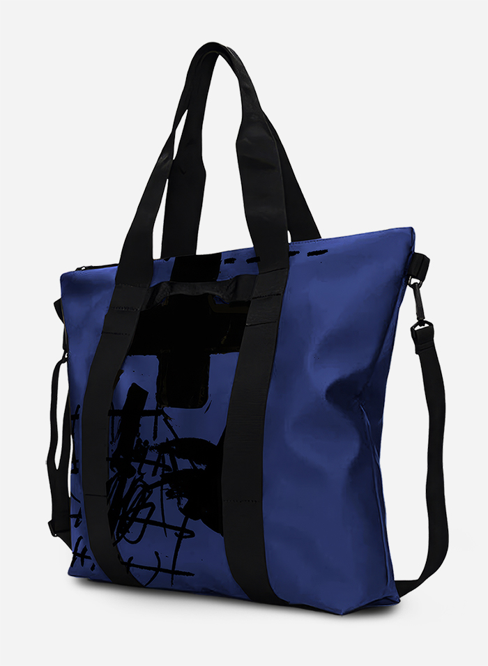
Guided by the subtle mechanics of garment patternmaking, Matin + Luca merges geometric precision with modern apparel design. By transforming essential drafting elements into a quiet visual signature, the identity frames every collection within a framework of pure form and tactile minimalism.
In the world of fashion, the pattern drafting grid is not merely a technical layout tool, but the structural backbone of every creation. The Matin + Luca brand name itself was born out of creative wordplay, connecting personal story with abstract aesthetics: two new words emerged as anagrams of the founder’s surname, transforming a personal element into a modern identity. The plus symbol (+) in the brand name acts as a structural bridge, highlighting balance and complementarity. The visual presence was built entirely upon this geometric premise; a grid system that defines rhythm, symmetry, stability, and density. Drawing inspiration from the alignment dots and lines used in pattern design, we developed a strict yet dynamic visual system. The grid points serve as fixed anchors where typography breathes, defining the information hierarchy across every medium. The bold, condensed logotype balances seamlessly with clean surfaces, reflecting an architectural approach to modern apparel. The application extends organically from tactile woven fabric tags and monochromatic packaging to editorial collateral, signage, and physical space, delivering a cohesive and unified experience.